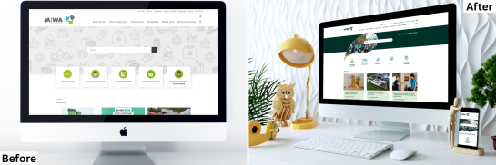

MIWA – A new visual identity, without a new technical process
Customer: MIWA - Afvalintercommunale Midden-Waasland
Link: MIWA.be
Go live:
- 2021 - Development of a new website
- 2026 – Launch of the new visual identity
Industry: Waste Management Sector
Services: Redesign
Partners: Kaplus (design)

At the end of 2025, MIWA launched a refreshed visual identity. Following the rebranding of, among other things, the waste magazine and waste collection calendar, the website was the logical next channel. As an important showcase for the organisation, miwa.be also needed to follow quickly, without changing the existing structure or functionality. For the communications department, it was important to keep the impact on day-to-day operations limited and ensure that the website could remain online without interruption.
Thanks to the solid technical foundation, we were able to dedicate our full attention to design and brand identity in 2026, without the burden of a complex technical project.
Klara Van der Gucht
Spokesperson and Communications Manager at MIWA

The challenge
MIWA was satisfied with the structure and functionality of the existing website. The request was therefore not to rebuild it, but to translate the new visual identity to the web efficiently and thoughtfully, while maintaining control over timing and budget. We had no intention of changing the structure of our website. It worked well. This was purely about the look and feel.
The approach
Thanks to the stable Drupal setup and the ongoing maintenance programme, the focus in 2026 could be placed entirely on design and visual development. In consultation with MIWA’s design agency, Kaplus, the team explored how the new visual identity could be applied digitally.
The collaboration got off to a fast and transparent start. Mock-ups were assessed for feasibility, after which Paddle.be technically translated the new style to the existing website through customised CSS, colours, typography and visual components.
Christa immediately explained very clearly how such a rebranding process works. She really put my mind at ease too: both the work involved and the costs were far more manageable than expected.
Because the structure was retained and the MIWA team was already very familiar with the CMS, implementation could proceed efficiently. As a result, reviewing and fine-tuning the pages went very smoothly.
Focus on accessibility and sustainability
All websites comply with the Web Content Accessibility Guidelines (WCAG). Thanks to a clear structure, strong colour contrast and a mobile-friendly design, each site is accessible to a broad audience. With the central Paddle platform, updates and improvements remain sustainable and scalable.
Accessibility was a key priority. Together with Paddle, we made a concerted effort to get it right.
The result
Today, the renewed website is the missing piece of the puzzle in the new visual identity. The overall result looks more professional, calmer and more human, with greater attention to imagery, white space and accessibility.
Our website is now a true calling card. It looks much more professional while also feeling much more human.
The new look and feel does more than improve the visual experience: it also supports communication with a broad and diverse audience. We deliberately opted for shorter, clearer copy and plenty of supporting visuals. As a result, the messages come across much more clearly, including to visitors who speak a different language.
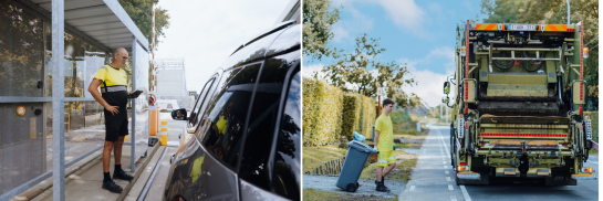
The impact also remained manageable for the communications department.
Long-term added value
This case shows how a future-proof website enables an organisation to respond quickly as it evolves. Today, MIWA can readily respond to current events, news and future optimisations.
Our website is not static. It shows that MIWA is an organisation in motion, in tune with what is happening around it.
The next step? Gaining more insight through analytics — again, starting from a strong, flexible foundation.